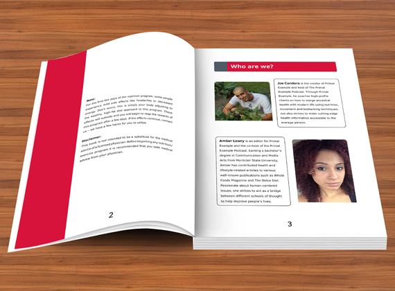

Multimedia is a combination of multiple media formats that combine to form a broad single word. When all the content such as text, audio, still images, animation, video, and interactivity come together, the result is multimedia.For example, slides. S combines all of the text and images and sometimes video as multimedia. In the case of the book layout, you have to plan very carefully.
Page shape, font style, the spacing between two lines, margins are all a big part of the layout of a book. Margins are the most important part of the layout of a book. Much remains to be done.

Most writers know that a great cover plays a significant role in the publication of any book. It attracts the reader deeply. But it is true that unfortunately, not all people pay much attention to the book. Some books are filled with great design material, but there is nothing significant inside. But to get people's attention, and to make them aware of your inner meaning, you should pay close attention to the book layout and it is very meaningful.
Margin is very important in book layout. It is recommended to have three margins. The top is where the author will be, that is, the author's name will be. Also, the page number can be kept. And the lower margin will judge your writing.
If there is any kind of art present in the book such as photographs, illustrations, or any other type then those layouts needs to be identified appropriately and for that, they need to be designed beautifully. In fact, in a photography book, at least every page should have a huge beautiful picture to look good. And all the photography should usually have a good caption and a brief introduction of the artist at the beginning.
Beautiful pages, a good combination of beautiful photography, captions, and a brief introduction of the artist, etc. will impress you, as well as your customers, will be able to impress. So it should work hire at your discretion.
Or call us now +91-9650-050-767
Lorem Ipsum is simply dummy text of the printing and typesetting industry.